


Introduction
On this post you'll learn how to use a emoji as favicon on your site. To achieve this, we'll build a simple web page that the user can change the favicon on the go. The web app will use:
- Next.js as React framework;
- Chakra UI as React component library
This blog post was inspired by this css-tricks post;
What you'll learn today
- Clone a github boilerplate to bootstrap our project;
- Use a emoji as a favicon;
- Dynamically change the emoji with react state;
Prerequisites
What do you need to go through this post:
- Basic knowledge of javascript;
- Basic knowledge of React;
- Node.js installed on your machine;
- Git installed on your machine;
Cloning the boilerplate
The boilerplate project is hosted on Github. To clone the repo you'll run on your terminal:
git clone https://github.com/jpc0rrea/emoji-as-favicon-boilerplate.git <name-of-your-project>
Then, access the project folder and install the dependencies:
cd <name-of-your-project>

# I use yarn, but you can use npm also
yarn

# run the project
yarn dev
Now the application is running on the port 3000. If you can access localhost:3000 you'll see this:
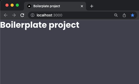
As you can see, the favicon still is the Vercel logo. We'll change that now.
Using a emoji as the favicon
To use a emoji as the favicon is really simple. You only need to add one line of code. This is possible now that the browsers supports SVG favicons. The line of code is:
<link rel="icon" href="data:image/svg+xml,<svg xmlns=%22http://www.w3.org/2000/svg%22 viewBox=%220 0 100 100%22><text y=%22.9em%22 font-size=%2290%22>🦦</text></svg>">
In a Next.js project like ours, we need to put this on the _document.tsx file, on the <Head> component. So let's do this:
// _document.tsx
import Document, { Html, Head, Main, NextScript } from 'next/document';
import { ColorModeScript } from '@chakra-ui/react';

import { theme } from '../styles/theme';

export default class MyDocument extends Document {
  render() {
    return (
      <Html>
        <Head>

          <link rel="preconnect" href="https://fonts.googleapis.com" />
          <link
            rel="preconnect"
            href="https://fonts.gstatic.com"
            crossOrigin="true"
          />
          <link
            href="https://fonts.googleapis.com/css2?family=Fira+Code:wght@300;400;500;600;700&family=Poppins:ital,wght@0,100;0,200;0,300;0,400;0,500;0,600;0,700;0,800;0,900;1,100;1,200;1,300;1,400;1,500;1,600;1,700;1,800;1,900&display=swap"
            rel="stylesheet"
          />
          <link
            rel="icon"
            href="data:image/svg+xml,<svg xmlns=%22http://www.w3.org/2000/svg%22 viewBox=%220 0 100 100%22><text y=%22.9em%22 font-size=%2290%22>🦦</text></svg>"
          ></link>
        </Head>
        <body>
          <ColorModeScript initialColorMode={theme.config.initialColorMode} />
          <Main />
          <NextScript />
        </body>
      </Html>
    );
  }
}
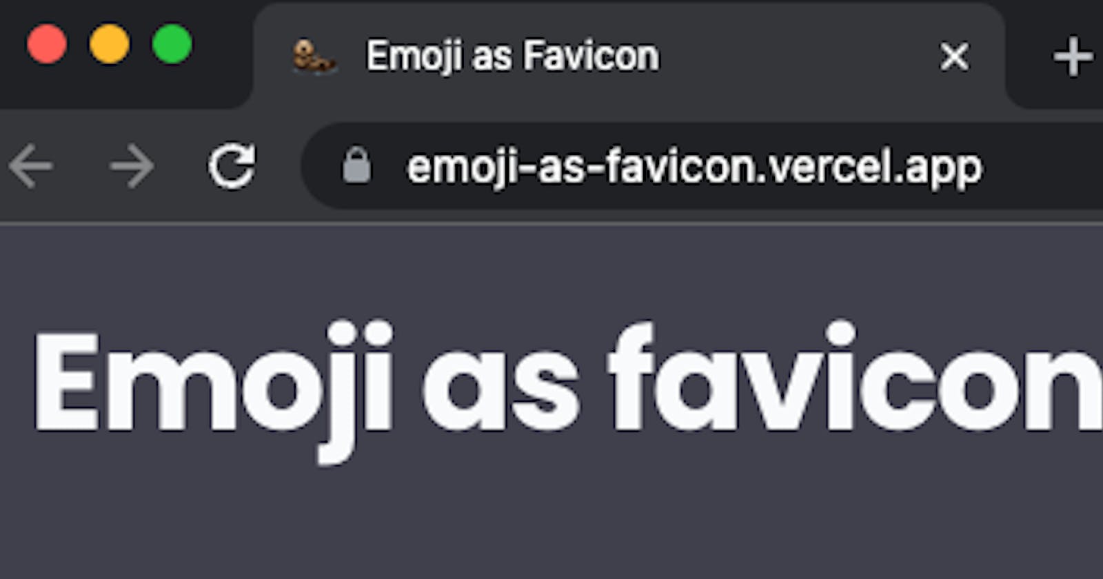
Now our favicon has changed! You can see our beautiful otter 🦦 as the favicon.
Dynamically change our favicon with the user interaction
The _document.tsx file it's only loaded when the project is loaded, so we can't change nothing dynamically there. But, we can use the Next.js <Head> component on the homepage of our app to change the favicon as we wish. So, let's remove the <link> that we recently coded at the _document.tsx and let's change the index.tsx file:
// index.tsx
import { Heading } from '@chakra-ui/react';
import type { NextPage } from 'next';
import Head from 'next/head';

const Home: NextPage = () => {
  return (
    <>
      <Head>
        <title>Boilerplate project</title>
        <meta name="description" content="Generated by create next app" />
        <link
          rel="icon"
          href="data:image/svg+xml,<svg xmlns=%22http://www.w3.org/2000/svg%22 viewBox=%220 0 100 100%22><text y=%22.9em%22 font-size=%2290%22>🦦</text></svg>"
        ></link>
      </Head>

      <Heading>Boilerplate project</Heading>
    </>
  );
};

export default Home;
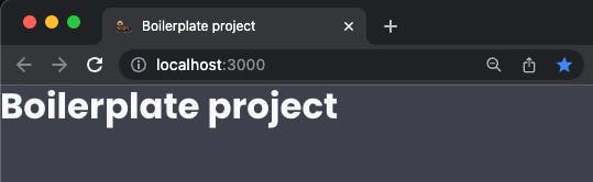
The result should be the same, the otter still is our favicon. Now, let's change this a little bit. To control which emoji it's going to be the favicon let's use the useState hook of React.
// index.tsx
import { Heading } from '@chakra-ui/react';
import type { NextPage } from 'next';
import Head from 'next/head';
import { useState } from 'react';

const Home: NextPage = () => {
  const [favicon, setFavicon] = useState('🦦');

  return (
    <>
      <Head>
        <title>Boilerplate project</title>
        <meta name="description" content="Generated by create next app" />
        <link
          rel="icon"
          // 👇🏽 We have to change the href tag to use `` instead of '',
          // 👇🏽 so we can use javascript variables inside the string.
          href={`data:image/svg+xml,<svg xmlns=%22http://www.w3.org/2000/svg%22 viewBox=%220 0 100 100%22><text y=%22.9em%22 font-size=%2290%22>${favicon}</text></svg>`}
        ></link>
      </Head>

      <Heading>Boilerplate project</Heading>
    </>
  );
};

export default Home;
Nothing much, but we're now using a state as the favicon. Now let's create a component that will act as a button, so the user can choose the favicon he wants.
Creating the EmojiCard component
Inside the src folder, let's create a components folder. Inside the new folder, let's create a EmojiCard.tsx file. We will use Chakra UI components to speed up the creation:
// EmojiCard.tsx
import { Flex, Heading, useColorModeValue } from '@chakra-ui/react';

interface EmojiCardProps {
  // the emoji that this card will show
  emoji: string;
  // the onClick handler for this card
  onClick: () => void;
  // the actual favicon, so we can style the active card accordingly
  favicon: string;
}

export function EmojiCard({ emoji, onClick, favicon }: EmojiCardProps) {
  // useColorModeValue because we're going to implement dark mode soon
  const cardBackgroundColor = useColorModeValue(
    'brand.backgroundGray',
    'gray.50'
  );

  return (
    <>
      <Flex
        backgroundColor={cardBackgroundColor}
        margin={['4', '8']}
        width="80%"
        height="80%"
        as="button"
        borderRadius="10"
        justify="center"
        align="center"
        transition="all .4s ease"
        border="6px solid"
        // add a yellow border to the active card/ emoji
        borderColor={favicon === emoji ? 'brand.yellow' : 'transparent'}
        shadow={['md', 'lg']}
        _hover={{
          transform: 'scale(1.05)',
          cursor: 'pointer',
          transition: 'all .4s ease',
        }}
        onClick={onClick}
      >
        <Heading fontSize="7xl">{emoji}</Heading>
      </Flex>
    </>
  );
}
Great! Now, let's use this component on the homepage. First, let's create an array that will store the emoji options, so we can map over it to render all the cards. Also, let's add some borders and padding, so our page can breathe. The index.tsx will turn into this:
// index.tsx
import { Flex, Heading, SimpleGrid } from '@chakra-ui/react';
import type { NextPage } from 'next';
import Head from 'next/head';
import { useState } from 'react';
import { EmojiCard } from '../components/EmojiCard';

const LIST_OF_EMOJIS = [
  '🐶',
  '🐱',
  '🐭',
  '🐹',
  '🐰',
  '🦊',
  '🐻',
  '🐼',
  '🐨',
  '🐯',
  '🦁',
  '🐮',
  '🐷',
  '🐸',
  '🐵',
  '🙈',
  '🙉',
  '🙊',
  '🐒',
  '🐔',
  '🐧',
  '🐦',
  '🐤',
  '🐣',
  '🐥',
  '🦆',
  '🦭',
  '🦦',
];

const Home: NextPage = () => {
  const [favicon, setFavicon] = useState('🦦');

  return (
    <>
      <Head>
        {/* 👇🏽 change the title and the description of the homepage */}
        <title>Emoji as Favicon</title>
        <meta
          name="description"
          content="A website that changes the favicon when the user select a new emoji"
        />
        <link
          rel="icon"
          // 👇🏽 We have to change the href tag to use `` instead of '',
          // 👇🏽 so we can use javascript variables inside the string.
          href={`data:image/svg+xml,<svg xmlns=%22http://www.w3.org/2000/svg%22 viewBox=%220 0 100 100%22><text y=%22.9em%22 font-size=%2290%22>${favicon}</text></svg>`}
        />
      </Head>

      <Flex direction="column" h="100vh">
        <Flex
          as="header"
          w="100%"
          h="20"
          mx="auto"
          mt="4"
          px="6"
          align="center"
          maxH="20"
        >
          <Flex w="100%" justifyContent="space-between">
            {/* Let's show the actual favicon on this Heading too! */}
            <Heading as="h2" size="2xl" fontWeight="bold" letterSpacing="tight">
              Emoji as favicon {favicon}
            </Heading>
          </Flex>
        </Flex>
        <SimpleGrid
          flex="1"
          gap="4"
          align="center"
          paddingBottom="6"
          justifyContent="space-between"
          // a css trick to always fill the screen with cards on the best way
          templateColumns="repeat(auto-fill, minmax(300px, 1fr))"
        >
          {LIST_OF_EMOJIS.map((emoji) => {
            return (
              <EmojiCard
                key={emoji}
                emoji={emoji}
                favicon={favicon}
                // when the user clicks on the card, turn the emoji into the favicon
                onClick={() => setFavicon(emoji)}
              />
            );
          })}
        </SimpleGrid>
      </Flex>
    </>
  );
};

export default Home;
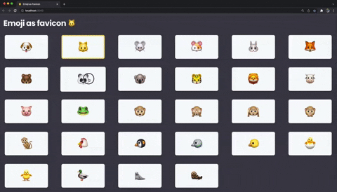
Perfect! Now we're changing the favicon when the users clicks on a card.
Add a randomize button (and light/ dark theme support)
Our boilerplate already has dark/ light theme supports! We just need to add a button so the users can changes the actual theme. For that, let's create a ToogleThemeButton.tsx file on the components folder. As I showed on this blog post, the components is something like this:
// ToogleThemeButton.tsx
import { IconButton, useColorMode, useColorModeValue } from '@chakra-ui/react';
import { RiMoonLine, RiSunLine } from 'react-icons/ri';

export function ToogleThemeButton() {
  const { colorMode, toggleColorMode } = useColorMode();

  const buttonBackgroundColor = useColorModeValue(
    'gray.50',
    'brand.backgroundGray'
  );

  const buttonBackgroundColorOnHover = useColorModeValue(
    'gray.300',
    'whiteAlpha.300'
  );

  return (
    <IconButton
      aria-label="Toogle theme"
      icon={colorMode === 'light' ? <RiMoonLine /> : <RiSunLine />}
      onClick={toggleColorMode}
      fontSize="20"
      backgroundColor={buttonBackgroundColor}
      _hover={{
        backgroundColor: buttonBackgroundColorOnHover,
      }}
    />
  );
}
Of course that we need to install the react-icons package:
yarn add react-icons
Now we can add the ToogleThemeButton on our header, like that:
// index.tsx
// ...
<Flex w="100%" justifyContent="space-between">
    {/* Let's show the actual favicon on this Heading too! */}
  <Heading as="h2" size="2xl" fontWeight="bold" letterSpacing="tight">
    Emoji as favicon {favicon}
   </Heading>

   {/* add the ToogleThemeButton to the header */}
   <Flex>
    <ToogleThemeButton />
   </Flex>
</Flex>
// ...
To create a randomize button it's pretty straightforward. We just need to create a function to randomize the favicon and add a button to execute the function! The function can be like that:
// index.tsx
// ...
const handleRandomizeClick = () => {
    const randomEmoji =
    LIST_OF_EMOJIS[Math.floor(Math.random() * LIST_OF_EMOJIS.length)];

    setFavicon(randomEmoji);
};
// ....
Now, let's add the button to the header:
// index.tsx
// ...
<Flex w="100%" justifyContent="space-between">
    {/* Let's show the actual favicon on this Heading too! */}
    <Heading as="h2" size="2xl" fontWeight="bold" letterSpacing="tight">
    Emoji as favicon {favicon}
    </Heading>

    {/* add the ToogleThemeButton and the randomize to the header */}
    <Flex>
        <Button
            onClick={handleRandomizeClick}
            colorScheme="yellow"
            marginRight="4"
        >
            Randomize!
        </Button>
        <ToogleThemeButton />
    </Flex>
</Flex>
And our index.tsx file will be this:
// index.tsx
import { Button, Flex, Heading, SimpleGrid } from '@chakra-ui/react';
import type { NextPage } from 'next';
import Head from 'next/head';
import { useState } from 'react';
import { EmojiCard } from '../components/EmojiCard';
import { ToogleThemeButton } from '../components/ToogleThemeButton';

const LIST_OF_EMOJIS = [
  '🐶',
  '🐱',
  '🐭',
  '🐹',
  '🐰',
  '🦊',
  '🐻',
  '🐼',
  '🐨',
  '🐯',
  '🦁',
  '🐮',
  '🐷',
  '🐸',
  '🐵',
  '🙈',
  '🙉',
  '🙊',
  '🐒',
  '🐔',
  '🐧',
  '🐦',
  '🐤',
  '🐣',
  '🐥',
  '🦆',
  '🦭',
  '🦦',
];

const Home: NextPage = () => {
  const [favicon, setFavicon] = useState('🦦');

  const handleRandomizeClick = () => {
    const randomEmoji =
      LIST_OF_EMOJIS[Math.floor(Math.random() * LIST_OF_EMOJIS.length)];

    setFavicon(randomEmoji);
  };

  return (
    <>
      <Head>
        {/* 👇🏽 change the title and the description of the homepage */}
        <title>Emoji as Favicon</title>
        <meta
          name="description"
          content="A website that changes the favicon when the user select a new emoji"
        />
        <link
          rel="icon"
          // 👇🏽 We have to change the href tag to use `` instead of '',
          // 👇🏽 so we can use javascript variables inside the string.
          href={`data:image/svg+xml,<svg xmlns=%22http://www.w3.org/2000/svg%22 viewBox=%220 0 100 100%22><text y=%22.9em%22 font-size=%2290%22>${favicon}</text></svg>`}
        />
      </Head>

      <Flex direction="column" h="100vh">
        <Flex
          as="header"
          w="100%"
          h="20"
          mx="auto"
          mt="4"
          px="6"
          align="center"
          maxH="20"
        >
          <Flex w="100%" justifyContent="space-between">
            {/* Let's show the actual favicon on this Heading too! */}
            <Heading as="h2" size="2xl" fontWeight="bold" letterSpacing="tight">
              Emoji as favicon {favicon}
            </Heading>

            {/* add the ToogleThemeButton and the randomize to the header */}
            <Flex>
              <Button
                onClick={handleRandomizeClick}
                colorScheme="yellow"
                marginRight="4"
              >
                Randomize!
              </Button>
              <ToogleThemeButton />
            </Flex>
          </Flex>
        </Flex>
        <SimpleGrid
          flex="1"
          gap="4"
          align="center"
          paddingBottom="6"
          justifyContent="space-between"
          // a css trick to always fill the screen with cards on the best way
          templateColumns="repeat(auto-fill, minmax(300px, 1fr))"
        >
          {LIST_OF_EMOJIS.map((emoji) => {
            return (
              <EmojiCard
                key={emoji}
                emoji={emoji}
                favicon={favicon}
                // when the user clicks on the card, turn the emoji into the favicon
                onClick={() => setFavicon(emoji)}
              />
            );
          })}
        </SimpleGrid>
      </Flex>
    </>
  );
};

export default Home;
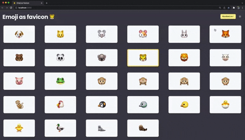
That's the result:
Next step and challenges
Congratulations! You've made it! 🎉 🥳. Now, some challenges so you can improve your coding skills with Next.js and React:
- Add all emojis separated by categories (like emojis-mart);
- Add some animation when the emoji changes;
- Add the source code of the
<link>tag dynamically (so the user can copy and add to their website);
Source code of the post and live project
There are the link to the: